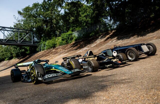
Armed with a large-screen television, a laptop computer, an iPad and a smartphone (smart being a noun and not an adjective), I set out to see how the 2026 version of Formula 1 racing looks. It is hard to see that the new cars are shorter and narrower. Unlike in the comparison images that accompany stories about the new regulations, there is no easily seen sense of scale. They certainly don’t look like the lumbering beasts of last year.
Very much smaller sidepods, all angled down towards the rear of the cars, give a reduced area for the principal sponsors’ logos in the Formula 1 2026 field. It used to be that these were priced according to their area in square centimetres – have some sponsors asked for a cost reduction? The area above the sidepods – the sides of the engine covers – carries no advertising logos, and it is clear that this surface is reserved for additional hot-air outlets on many of the cars at more demanding circuits.
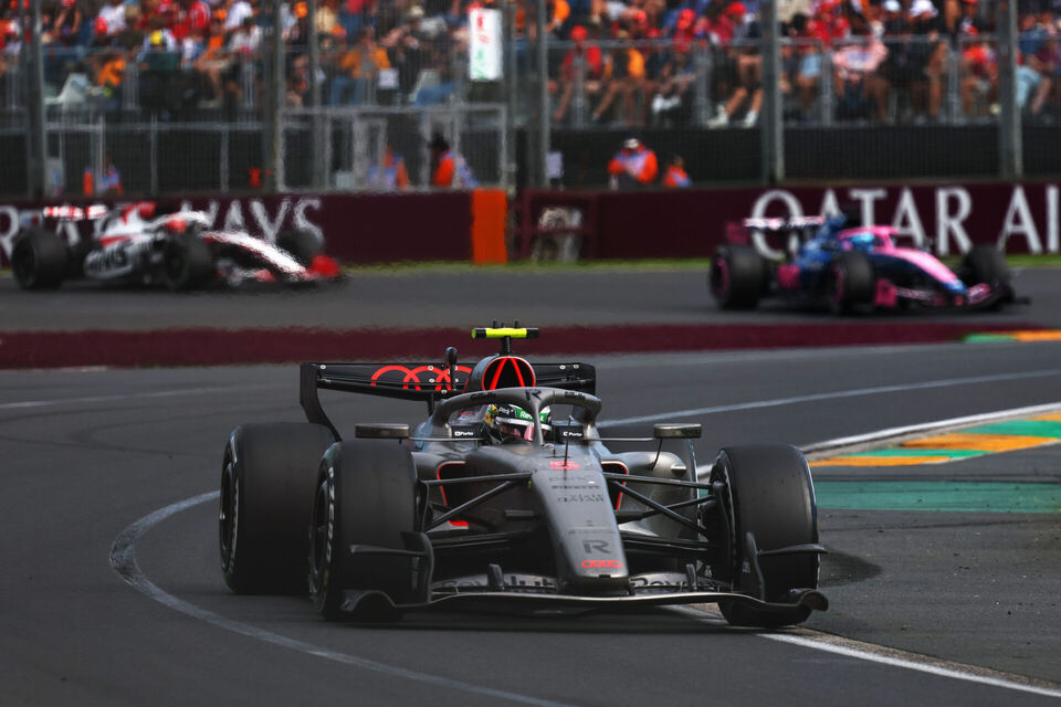
As for the actual spectacle of the new cars on track in Formula 1 2026, there are occasional moments when they look blindingly fast and longer moments when they appear alarmingly slow. Have the new regulations allowed the cars to run closer together? The first few laps would suggest that this is possible.
But the wide disparity in performance across the Formula 1 2026 field away from the start suggests unpredictable behaviour from the cars, rather than the drivers, and unpredictable actions and reactions have no place in Formula 1. The FIA needs to take note of this; multiple ‘near misses’ could be seen in the overhead start-camera shots.
Mercedes
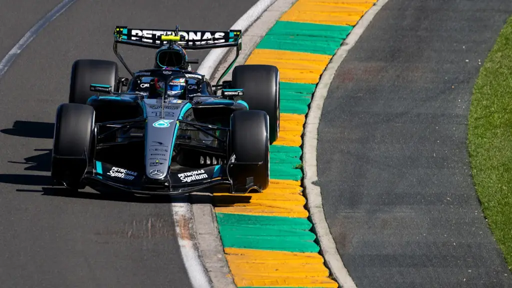
The black, silver and Petronas turquoise take a lovely line from the nose to the front of the halo, but then the turquoise droops sadly over the front of the side pod. The graphic lines should either complement the form or attack it. Silver patches on the top surface of the side pods are hard to understand. They make the car look fussy and tend to overpower the minor sponsors’ logos. But the cars are easy to recognise, even on a handheld device.
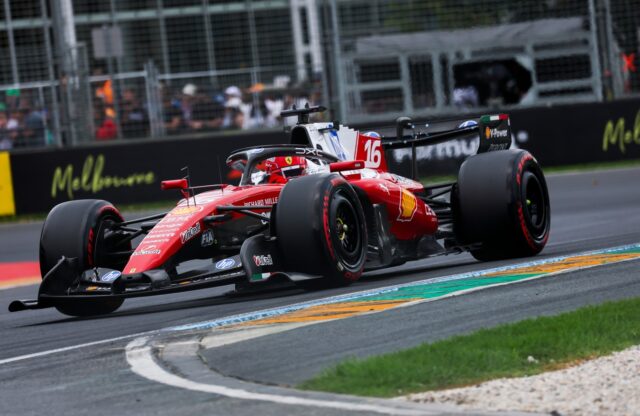
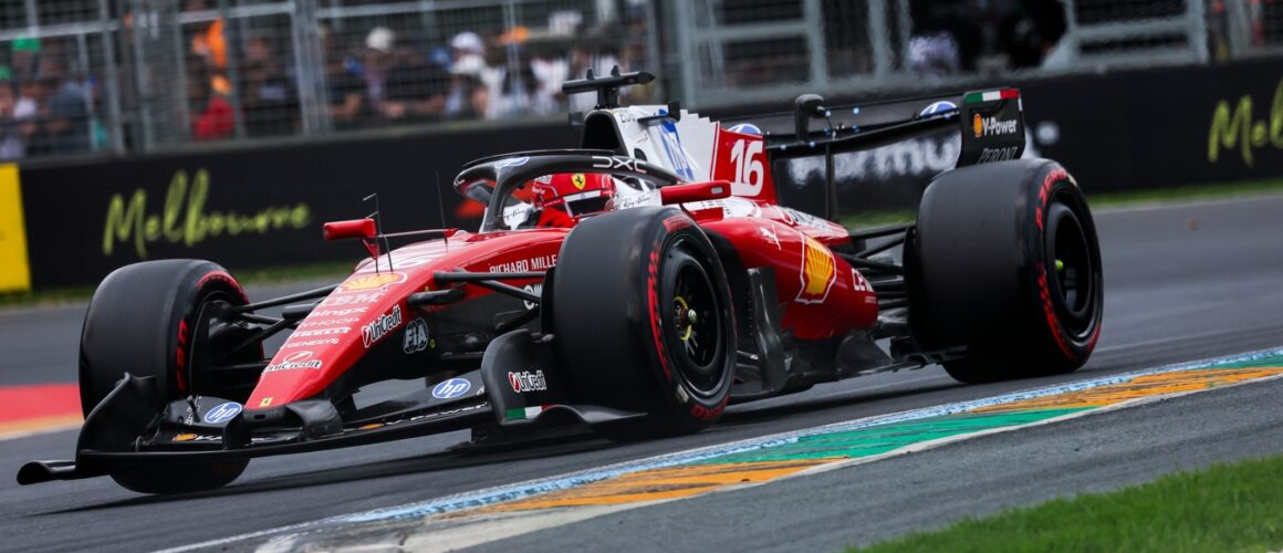
Ferrari
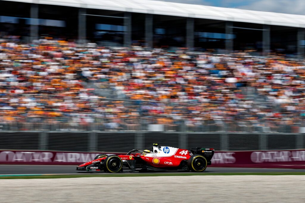
Ferrari has claimed that its 2026 livery is a tribute to earlier colour schemes, but those were always crisp and added a sense of speed. The new car has a very lazy red-white division line that wanders across the engine cover surfaces. Many Ferrari fans have criticised the blue ‘HP’ logos on the engine cover fin for looking out of place, and they mention the fact that a green line between the red and the white would have paid tribute to the Italian national colours.
Red Bull
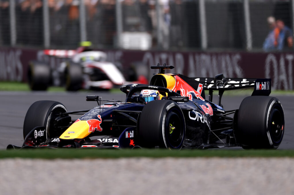
The red, yellow and blue always work so well, and the tip of the nose in yellow is unmistakable – as is the bull on the engine cover. The minor sponsors’ logos tend to get lost within the very strong overall graphic, but that was always the case. The giant engine air intake, which probably does other jobs, too, looks aggressively brutalist compared with other elements of the design.
McLaren
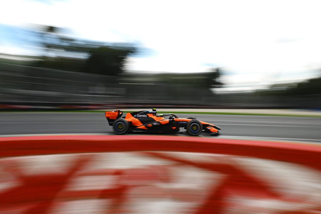
The strong Papaya (orange) upper surfaces contrast with the 2025 rearward-sloping black and will be easily read on the TV, but the cars look curiously ‘sponsor light’, particularly on the nose surface. The very weak numbers ‘1’ and ’81’ are a missed opportunity for a bit of graphic cohesion. Sponsor names on the upper nose surface are unreadable.
Racing Bulls
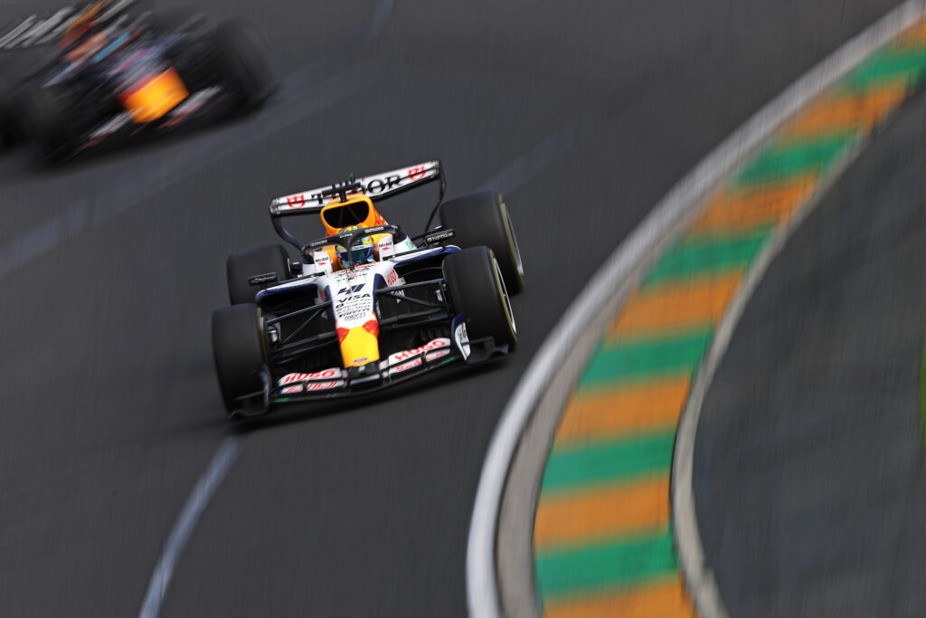
What I tend to call the ‘White Bulls’. The livery almost looks as if it were designed in plan view; it looks great from directly above. There is enough white in the colour scheme to differentiate Racing Bulls from the senior team. The side pods do appear rather fat, giving plenty of space for the ‘Visa’ sponsorship. There is an amusing herd of blue bulls at the end of the engine cover, but unfortunately these will only be seen by the most beady-eyed viewer.
Williams
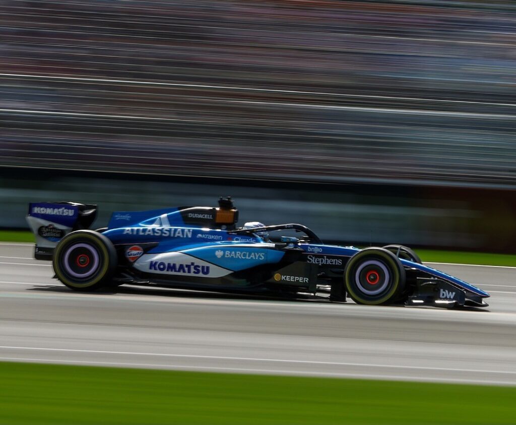
The launch livery had a nice contrast of light and dark blue on the upper surfaces, but as seen at Melbourne there is now a much weaker upper blue that does not work well on any device. There is a rather crude colour break across the side pods where space is shared by two sponsors, one on a white background and the other on a very pale blue, which breaks up the flow of the scheme.
Audi
A brutalist vertical division between the silver front and the black and pink/orange of the rear makes the car look heavy and fat, and there is no dynamism to the scheme. Vertical lines rarely work well on F1 machinery. There is some very strange surface modelling at the front of the side pods, but it is not seen on smaller handheld devices.
Haas
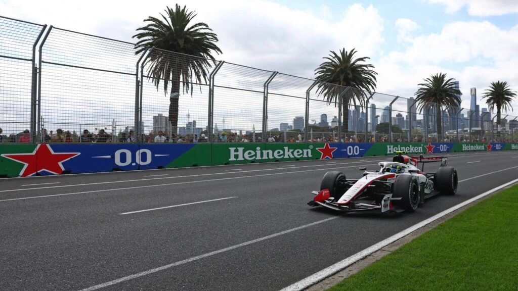
There is a strong black-lined, red element to the livery. The whole car looks much more cohesive than in previous years. But, of course, a lack of multiple sponsors can make for a much tidier-looking car. I do rate it quite highly, although there is a nasty little red square element at the front of the engine cover – once seen, it cannot be forgotten.
Cadillac
There were such great expectations for the livery of the new 11th team. As a charming tribute to all the members of the team, the test car had a list of names on the nose. This has been replaced by a dark and gloomy, mostly black with splashes of white, very complex livery with side pods that differ from side to side. I thought that was banned from the BAR days. When you see a fussy, grey-looking car, that will be the Cadillac.
Aston Martin
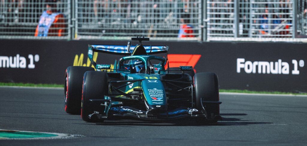
As usual, a lovely overall metallic green – which looked great at the launch – but less eye-catching as a satin wrap with an insipid yellow line wandering off the nose. Yet another version of Newey’s hot-air radiator outlet appeared in Melbourne with complex surface changes that spoil the elegance of the car. Unfortunately, there was plenty of time to study the car during its prolonged immobile periods.
Alpine
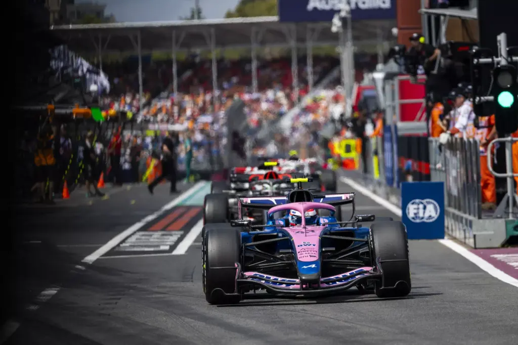
Painting the halo livid pink breaks up the colour scheme in an unattractive way, but the Alpine blue always looks sophisticated, and the pink will show well on TV. The white-on-pink letter ‘A’ looks to be sliding off the back of the engine cover, and it is unfortunate that, with the metallic blue being Alpine’s colour, the pink seems inappropriate.